
 Choosing a name and imagery that represents a company’s or organization’s brand must be both a thoughtful, and strategic endeavor. Names/words, imagery, themes and even color are an introduction (or re-introduction) to your target market…aka, your world – which can include individuals, businesses, organizations or stakeholders. Vicarious Multimedia (VM) recognizes the power its own presence in the marketplace can communicate and sets out every day to perpetuate a purpose-filled brand that strongly supports – and adeptly represents – our core vision. Our motto sums it up succinctly; Vision……. Delivered.
As a marketing communications and public relations (PR) firm that prides itself on how we forward-face to our world, it was imperative from the onset of our recent rebrand that our name mirror the company’s philosophy…which is to inherently understand the client…in order to expertly communicate on their behalf…so we can effectively reach their desired target market…while exceeding their goals for growth and exposure. Our name also needed to best represent the range of services we provide.
Name Change/Modification Formerly named Vicarious Productions (2006-2019) this past year, Productions was replaced by Multimedia. Why? We listened to the market and found that an overwhelming presumption was that we were solely a ‘video production’ firm… but VM is so much more! This name change better represents all the mediums and channels through which we communicate messages on behalf of our clients by us. This new name, Vicarious Multimedia accomplishes just that.
What’s in a Name? According to Merriam Webster, the term ‘vicarious’ is ‘to experience in the imagination through the feelings or actions of another.’ This definition mirrors the method in which VM provides communication services for our clients – one in which our team works diligently to see through the eyes of our clients; to intimately understand who they are, what they do and how they provide value to their target demographic or audience. The Vicarious part of our name just had to stay, because it just simply speaks to our constant approach.
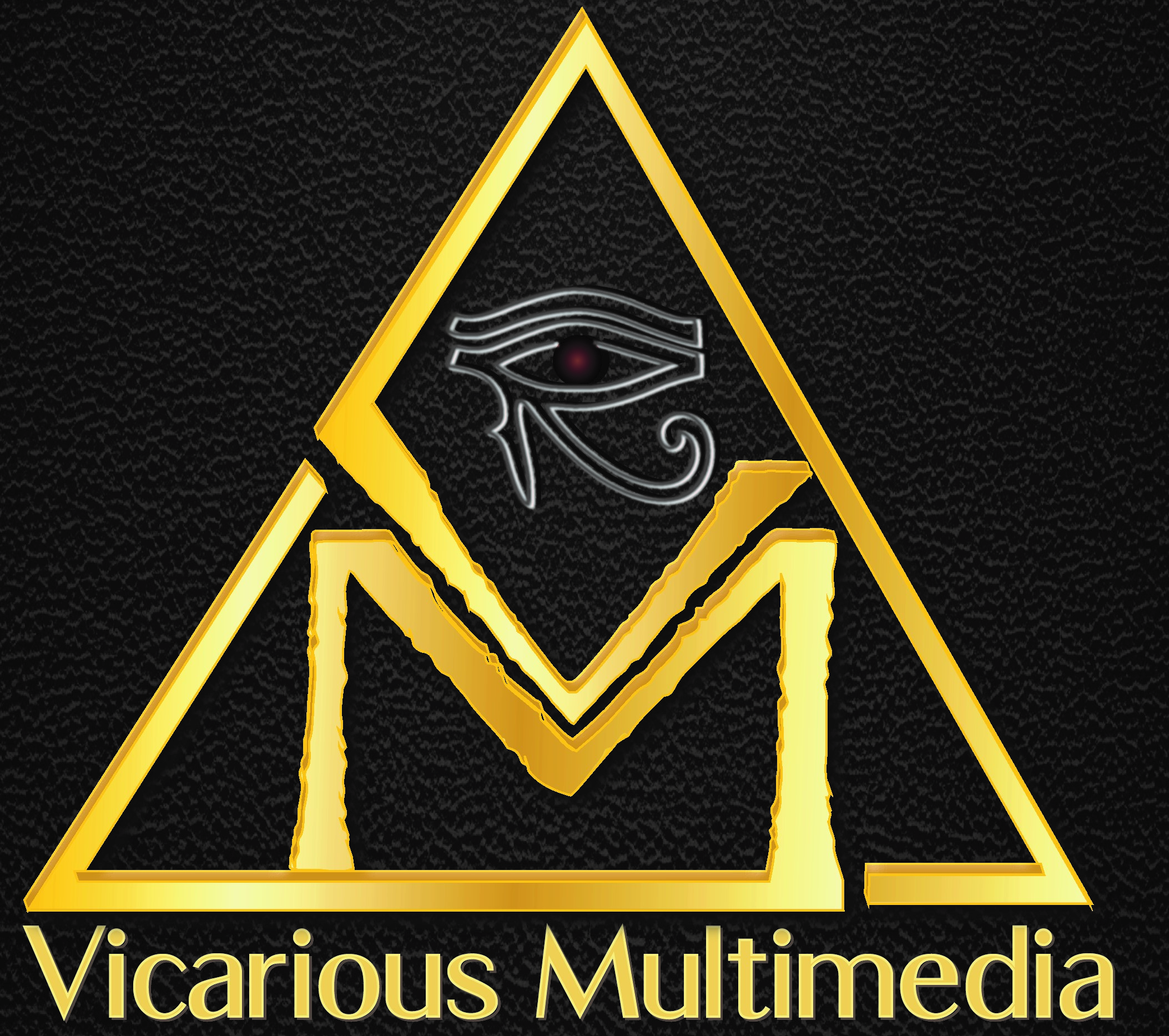
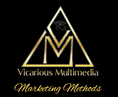
Image and Meaning The VM logo was carefully re-constructed during our rebrand. The imagery of the Eye of Horus comes from Egyptian Mythology (a part of our brand and image since nearly the beginning in 2006). It symbolizes protection, health, power, vision and clarity – all of which are overarching offerings through our marketing and PR services. Protection by way of consistent and strategic marketing and public relations services so that our clients are effectively connected to – and communicating to – their desired market. This includes image development (or redevelopment) and ongoing communications that contribute to the overall health of the client. This health ultimately assists them in remaining powerful – in their marketplace, and beyond. PR as a specialty, assists our clients to see and be seen clearly through tragedy or crisis. We preserve – and in serious cases can resurrect – the public image of our clients. Through this, their power in the marketplace continues, and is primed to grow.

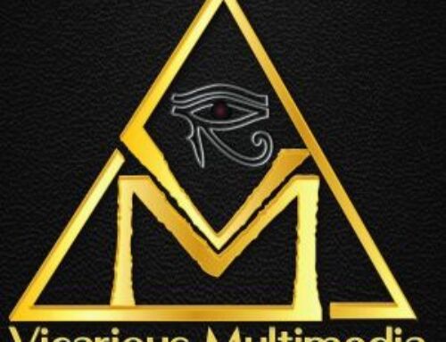
Evolution of the VM brand-see how our logo has transformed over the last 13 years.
Font and Supporting Imagery Within the VM logo, there are aspects that represent both the ancient past and modern age. The font used for the ‘V’ and ‘M’ is inspired by the Papyrus font – which lends to the imagery that represents a traditional perspective relative to service delivery; VM prides itself on delivering the vision of our clients (through partnering and consulting) no matter what it takes. While there is certainly a nod to an ‘old world’ approach to our services, there is also a literal ‘edge’ to the font – representing that we utilize the latest, modern digital tools which are threaded through all of our communication services.
Importance of Color The colors within the VM logo were chosen to represent the ‘gold standard’ in communications – something VM strives to attain daily. The black background creates a stark contrast that builds the visual strength of our brand. The deep red in the Eye of Horus represents the passion we weave into all our work. While the framework of the overall VM brand did remain constant, these strategic changes to the name and imagery have provided what we believe makes a powerful impact that more adeptly defines/redefines who we are.
When done with care, effective branding/rebranding can create a positive and profound experience for the audience or consumer; one that not only entices them but engages them to learn more resulting from that initial visual attraction. This can lead to a deeper understanding of what a company or organization offers, and the ultimate growth of a brand.
Vicarious Multimedia is a marketing communications and public relations firm that serves businesses, nonprofits, professional associations and local government. Visit VicariousMM.com to learn more.


